因為研究需要,搜尋了用R畫存活曲線的方法,並調整了圖形參數以及將多張存活曲線圖合併排列,整理成此篇文章。
什麼是存活曲線?
簡單來說,就是將沒發生事件的比例當x軸,時間當y軸所繪製出的圖形。可參考維基百科的說明。
用R畫存活曲線所需套件
在R中有蠻多畫存活曲線相關的套件,我的初版程式是使用ggfortify套件,但後來Editor要求要在圖上加Number at risk的資訊,查了一下發現ggfortify套件沒有這個功能,又不想手動加,就重新搜尋了資源,找到一篇介紹survminer套件的文章,也是以ggplot套件為做圖基礎,方便之後調整格式,最後成功完成完整的survival plot。
本介紹文以survminer R package: Survival Data Analysis and Visualization為基礎,並衍伸其他條件設定的教學。
以下介紹用survminer套件 (官方說明文件) 畫存活曲線的步驟
首先載入survminer套件以及處理資料必須的survival套件 (需要套件中的Surv()函數)
library(survival)
library(survminer)
範例資料
以survival套件內附的lung資料為例,資料包括:
(以下資料翻譯自survival套件說明文件)
- inst: 機構代碼
- time: 存活時間 (單位為日)
- status: “設限”或“事件發生”狀況,1為設限,2為事件發生,在此為死亡
- 1=censored
- 2=dead
- age: 年紀 (單位為年)
- sex: 性別
- Male=1
- Female=2
- ph.ecog: 醫生評估的ECOG體能狀況評估分數
- 0= asymptomatic
- 1= symptomatic but completely ambulatory
- 2= in bed <50% of the day
- 3= in bed > 50% of the day but not bedbound
- 4= bedbound
- ph.karno: 醫生評估的Karnofsky體能狀況評估分數
- bad=0-good=100
- pat.karno: 病人自己評估的Karnofsky體能狀況評估分數
- meal.cal: 卡路里攝取量
- wt.loss: 過去六個月體重下降多少
lung %>% head()| inst | time | status | age | sex | ph.ecog | ph.karno | pat.karno | meal.cal | wt.loss |
|---|---|---|---|---|---|---|---|---|---|
| 3 | 306 | 2 | 74 | 1 | 1 | 90 | 100 | 1175 | NA |
| 3 | 455 | 2 | 68 | 1 | 0 | 90 | 90 | 1225 | 15 |
| 3 | 1010 | 1 | 56 | 1 | 0 | 90 | 90 | NA | 15 |
| 5 | 210 | 2 | 57 | 1 | 1 | 90 | 60 | 1150 | 11 |
| 1 | 883 | 2 | 60 | 1 | 0 | 100 | 90 | NA | 0 |
| 12 | 1022 | 1 | 74 | 1 | 1 | 50 | 80 | 513 | 0 |
基本存活曲線
在準備完資料後,可用survfit()函數製作存活模型,並以ggsurvplot()函數繪製存活曲線,survfit()函數的重要參數包括
- formula:
Surv(時間,設限或事件狀態)~分組依據,在這個範例為Surv(time,status)~分組依據 - data: 資料名稱,在這個範例為lung
以最簡單的單一族群存活區限為例,想要畫這個資料集中所有病人的存活曲線,其實就是不分組的意思,可將分組依據設定成單一數字1,如下列範例
fit<- survfit(Surv(time, status) ~ 1, data = lung)
ggsurvplot(fit)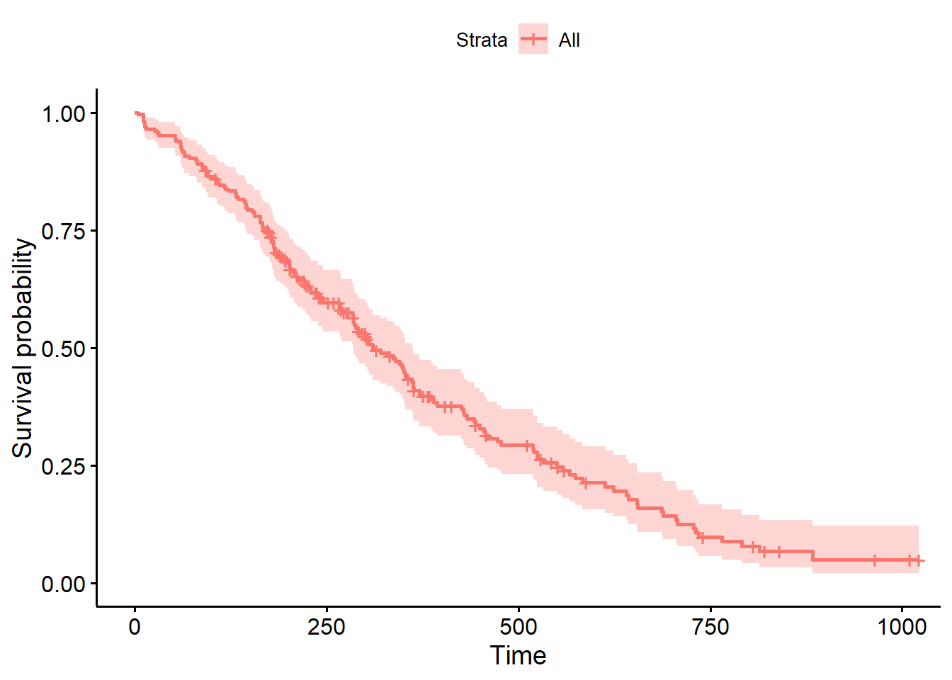
以此類推,若想用性別做分組,也就是男生畫一條存活曲線,女生也畫一條,並放在同一張圖上,此時就將性別sex做為分組依據,如下範例
fit<- survfit(Surv(time, status) ~ sex, data = lung)
ggsurvplot(fit)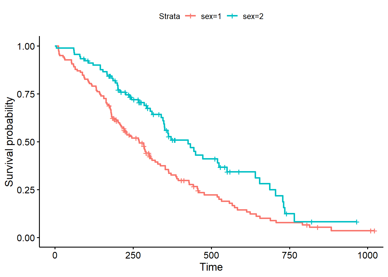
增加P value
將ggsurvplot()函數的pval參數設定為TRUE,即可在圖中加上兩組檢定的P value,這個P value也可以用surv_pvalue()函數取得,預設的檢定方法為log-rank test,若想要修改,也可以透過設定pval.method參數修改。
ggsurvplot(fit, pval = TRUE)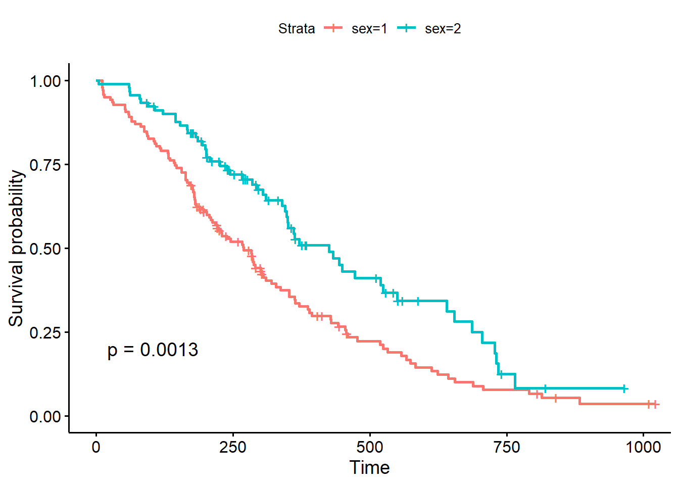
可進一步用pval.coord = c(100, 0.03)調整P value顯示位置
ggsurvplot(fit, pval = TRUE, pval.coord = c(100, 0.03))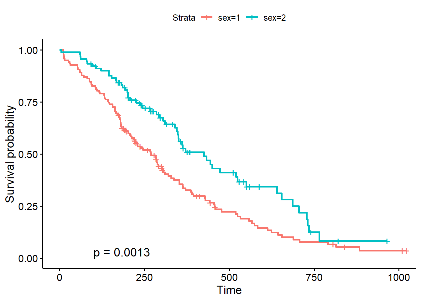
增加信賴區間
若生存曲線圖形要加上信賴區間的話,可設定conf.int = TRUE
ggsurvplot(fit, pval = TRUE, pval.coord = c(100, 0.03),
           conf.int = TRUE)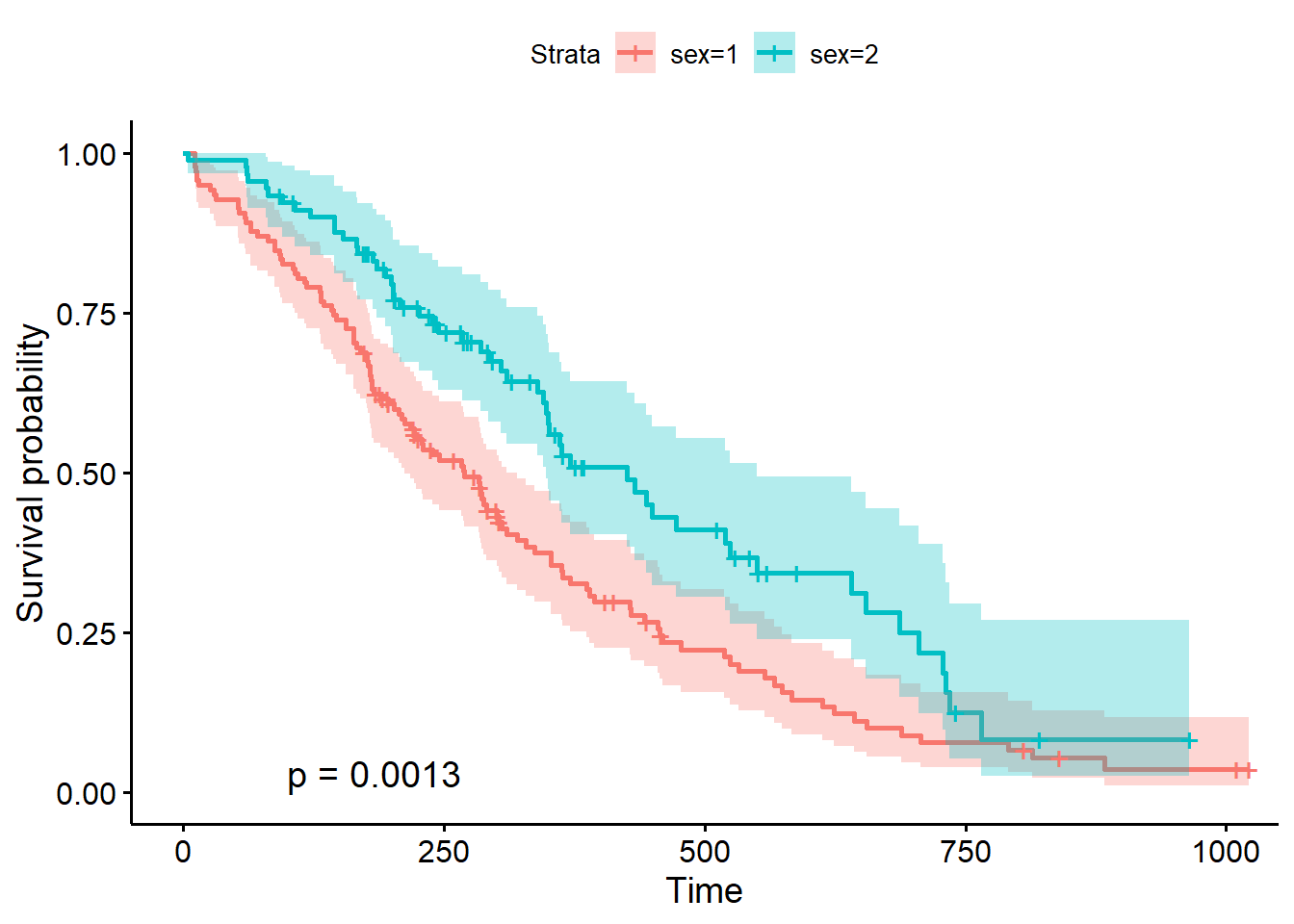
增加number of risk 表格
將ggsurvplot()函數的risk.table參數設定為TRUE,即可在圖中加上number of risk 表格
ggsurvplot(fit, pval = TRUE, pval.coord = c(100, 0.03),
           conf.int = TRUE,
           risk.table = TRUE)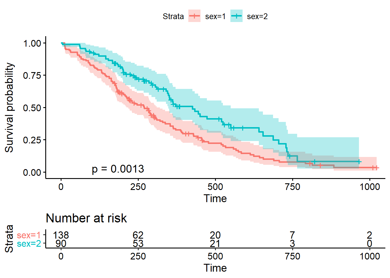
若不想要number of risk 表格Y軸文字的顏色,可將risk.table.y.text.col參數設成FALSE
ggsurvplot(fit, pval = TRUE, pval.coord = c(100, 0.03),
           conf.int = TRUE,
           risk.table = TRUE, risk.table.y.text.col = F)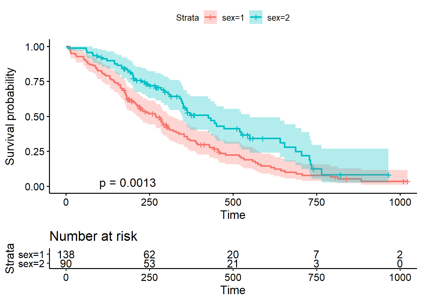
格式微調
可分為存活曲線調整與number at risk表格調整,調整參數如下
font.main = 12圖表標題字型大小,也可進一步設定字型樣式,如c(12,"bold.italic", "red")font.x = 12圖表X軸字型大小font.y = 12圖表Y軸字型大小fontsize = 3Number at risk內文字型大小linetype = "strata"改變線條樣式,一個類別一種樣式,適合製作黑白圖形時,可搭配palette = "grey"參數break.time.by = 100每100天設一個標記font.tickslab = 10標記字型大小(100, 200, …等)legend.title = "Sex"將圖示標題改成大寫開頭的Sexlegend.labs = c("Men", "Women")將圖示文字改為Men或是Womentitle="Format setting"加上圖形標題xlab="", ylab=""X軸Y軸標題設定legend = "none"不要圖示,因為Number at risk表格有了或是也可設定位置,如legend = c(0.2, 0.2)tables.theme = clean_theme()設定Number at risk表格樣式
若想改Number at risk表格的標題,只能用額外的程式碼theme(plot.title = element_text(size = 10))設定
res<-ggsurvplot(fit, pval = TRUE, pval.coord = c(100, 0.03),
                conf.int = TRUE,
                risk.table = TRUE,
                font.main = 12,
                font.x =  12,
                font.y = 12,
                font.tickslab = 10,
                fontsize = 3,
                linetype = "strata",
                break.time.by = 100,
                legend.title = "Sex",
                legend.labs = c("Men", "Women"),
                title="Format setting",
                xlab="X Test", ylab="Y Test",
                legend =  "none",
                tables.theme = clean_theme())
res$table <- res$table +
  theme(plot.title = element_text(size = 10))
res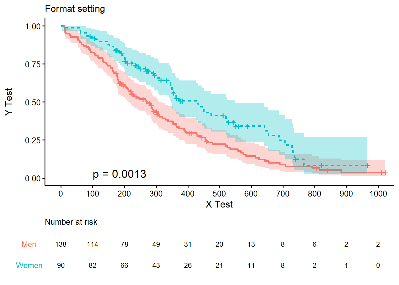
客製化P value顯示方式
預設的P value是四位小數點,有時不太需要這麼多資訊,只需把小於0.01的值用<0.01來表示 (通常是<0.001才轉換,但這邊為了呈現效果改為<0.01),那就需要在畫圖前先處理。這邊使用surv_pvalue(fit)$pval來取得P value p後,更進一步用if else來將數值轉成文字,最後在ggsurvplot()函數中,將pval = p參數設定為p,就能調整P value的顯示方法
p<-surv_pvalue(fit)$pval
if(p<0.01){
  p<-"p<0.01"
}else{
  p<-paste0("p=",round(p,3))
}

resP<-ggsurvplot(fit, pval = p, pval.coord = c(100, 0.03),
                conf.int = TRUE,
                risk.table = TRUE,
                font.main = 12,
                font.x =  12,
                font.y = 12,
                font.tickslab = 10,
                fontsize = 3,
                linetype = "strata",
                break.time.by = 100,
                legend.title = "Sex",
                legend.labs = c("Men", "Women"),
                title="Format setting",
                xlab="X Test", ylab="Y Test",
                legend =  "none",
                tables.theme = clean_theme())
resP$table <- resP$table +
  theme(plot.title = element_text(size = 10))
resP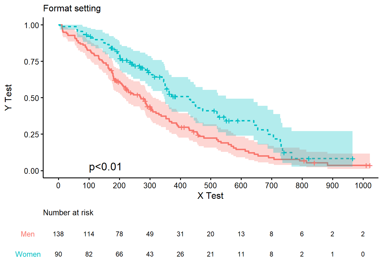
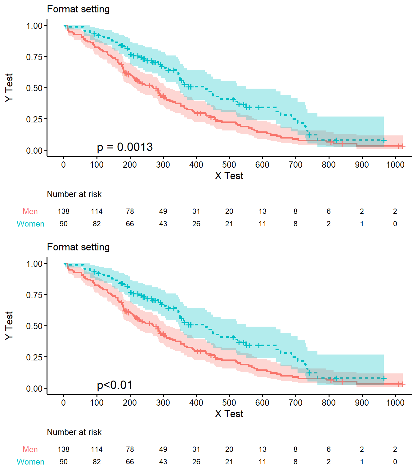
合併多張存活曲線圖形
因ggsurvplot()畫出的圖形無法使用常見的grid.arrange()函數排序,survminer套件另有排列多圖的方法arrange_ggsurvplots(),使用方法是將多個ggsurvplot圖形放入list,作為arrange_ggsurvplots()的第一個參數,之後利用ncol設定Column數,nrow設定Row數,risk.table.height設定Number at risk表格高度
以下是橫放範例
arrange_ggsurvplots(list(res, resP),
                    ncol=2, nrow=1,
                    risk.table.height = 0.22)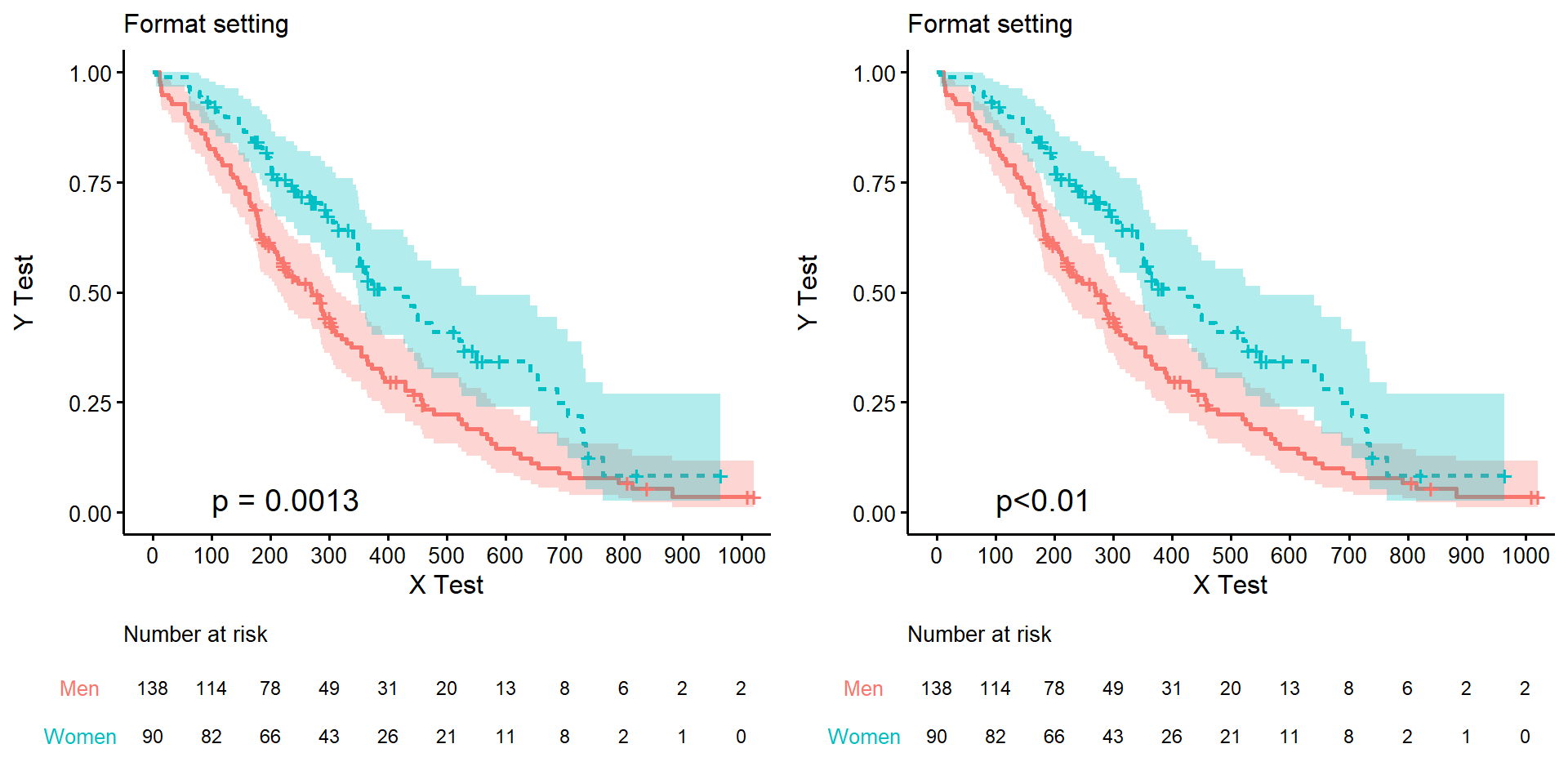
直放範例
arrange_ggsurvplots(list(res, resP),
                    ncol=1, nrow=2,
                    risk.table.height = 0.22)